Posts: 2,603
Threads: 46
Joined: Sep 2008
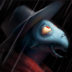
On the mutant chicken, the mouth area (fur) looks a bit pillowshaded, shouldn't it be darker there because his mouth is huge and shadows it? The grass really looks unfinished compared to the rest of the picture.
I love that Mega, man. Except maybe for the "boot" look his feet are having. They shouldn't look like boots. But it's still super cute.
At 16 years old, I wasn't half this good.
Keep going, don't give up on Pixel Art like I did.

Posts: 1,662
Threads: 44
Joined: May 2008
(10-13-2008, 11:37 PM)Mr. Buttbutt Wrote: On the mutant chicken, the mouth area (fur) looks a bit pillowshaded, shouldn't it be darker there because his mouth is huge and shadows it? The grass really looks unfinished compared to the rest of the picture.
I love that Mega, man. Except maybe for the "boot" look his feet are having. They shouldn't look like boots. But it's still super cute.
At 16 years old, I wasn't half this good.
Keep going, don't give up on Pixel Art like I did. 
Haha, thanks. The grass on the chicken thing is nowhere NEAR finished, at all. And yeah, I'll play around with the lip/mouth area.
I thought MegaMan wore boots :V Thanks though.
Also another WIP sprite in my avatar. :]
Posts: 2,603
Threads: 46
Joined: Sep 2008
That style is so cute. And because it's small, the choppy animation fits it well. Be sure to animate it well when it's big.

Posts: 1,662
Threads: 44
Joined: May 2008
Haha, yeah.
It's Cave Story style, if you didn't already realize that. But shhhh...there's totally not a game being made out of this.

(also rabid do you have like an msn or an aim?)
Posts: 2,603
Threads: 46
Joined: Sep 2008
I have YIM, but I'm rarely on.
But classes end this week, so let me go through hell week first. :>
Posts: 1,662
Threads: 44
Joined: May 2008
![[Image: cavestorymariogp2.png]](http://img262.imageshack.us/img262/8075/cavestorymariogp2.png)
Sheet update

![[Image: screeniewipvl0.png]](http://img406.imageshack.us/img406/9191/screeniewipvl0.png)
also a WIP mockup for a game...the bird scene will be finished by next week hopefully..
Posts: 1,580
Threads: 19
Joined: May 2008
I love the Mario, and I love that scene! Very nice pixelwork there Dex!
Posts: 1,662
Threads: 44
Joined: May 2008
Posts: 306
Threads: 4
Joined: May 2008
10-15-2008, 08:19 PM
(This post was last modified: 10-15-2008, 08:19 PM by Stirred Drei Ling.)
Too much praise in this topic, granted you do deserve most if not all of it.
I think Mario's head should turn a bit when walking. The simple style is well made, but is alot like Cave Story in some aspects. Maybe make Mario's nose smaller too.
Posts: 1,662
Threads: 44
Joined: May 2008
Did you
not ready what I said at all
"It's Cave Story style, if you didn't already realize that. But shhhh...there's totally not a game being made out of this. "
Making the nose smaller also looks awful, we've tried that. Thanks though.
Posts: 306
Threads: 4
Joined: May 2008
No because I am a dumb nut.
And I see the nose balances out the hat. So okay, good job Dex.
Posts: 970
Threads: 33
Joined: May 2008

I hate walk cycles with head turns. I honestly can't stand them, I mean, imagine if you did that in Real life.
You would look like an idiot.
Posts: 1,662
Threads: 44
Joined: May 2008
Yeah.
Bumping this because I need comments before I continue :L
Posts: 1,293
Threads: 25
Joined: May 2008
(10-17-2008, 08:32 PM)Teeks Wrote: I absolutely love that Mario. You better continue >
This.
I love Cave Story style


![[Image: ZRdfkWQ.jpg]](http://i.imgur.com/ZRdfkWQ.jpg)
![[Image: Fd199.png]](http://i.imgur.com/Fd199.png)

![[Image: cavestorymariogp2.png]](http://img262.imageshack.us/img262/8075/cavestorymariogp2.png)

![[Image: screeniewipvl0.png]](http://img406.imageshack.us/img406/9191/screeniewipvl0.png)


![[Image: scaled.php?server=441&filename=ipposig.png&res=medium]](http://desmond.imageshack.us/Himg441/scaled.php?server=441&filename=ipposig.png&res=medium)