09-25-2009, 11:51 PM
(This post was last modified: 09-26-2009, 12:05 AM by xdonthave1xx.)
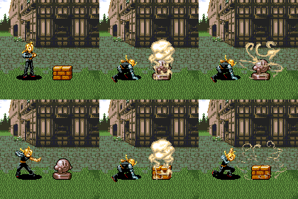
Did you use Gens to rip these?
I ask, because they look a little big (like maybe 2 or 3 times the size).
Also, did you use any filters on your emulator? They look blurry.
I ask because Gens is probably one of the stupidest emulators when it comes to screenshotting (it's pretty much using Print Screen [so if anything is in the window, it gets caught in the image, as opposed to other emulators that take a picture of ONLY the virtual screen]).
Edit: I don't want to discourage you, because it has potential. Just be careful with some emulators (like Gens), and you might possibly align the screaming mimis a bit better when you fix the image problem (also, don't be afraid of blank space, but do try to reduce it as much as you can. And don't be afraid to some it if eliminating it would ruin the organizing of your sheet).
Edit 2: Sorry about that. While sadly you may need to redo these, (this will be assuming the sheets were of acceptable quality) the bloodpuppet sheet could possibly be arranged better by moving the acid to below the dieing animation either with a smaller box or without the box and your credit tag below the puddle of gore that I assume WAS the puppet. This would help reduce the size of the sheet by having a large portion you could remove from the bottom (as I said, don't be afraid of blank space, but reduce where you feasibly can).


![[Image: Game.gif]](http://i33.photobucket.com/albums/d77/xdonthave1x/Game.gif)
![[Image: image.gif]](http://i33.photobucket.com/albums/d77/xdonthave1x/image.gif)
![[Image: FF12.gif]](http://i33.photobucket.com/albums/d77/xdonthave1x/FF12.gif)